Hello!
It’s that time of year where we all anticipate the color trends for 2020. Color is not just about paint. These yearly trend colors can be used in all areas of lifestyle to set a mood or emotion. Accessories, window treatments, furniture, and paint are just a few areas to add hints of the color of the year.
The Pantone Color Institute and paint companies choose their own color of the year. They try to forecast a worldwide point of view on where color is going in the future.
Check out below to see what your favorite paint company has in store for you in the coming year!
The Pantone Color Institute
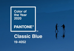
Chosen for it’s calm, confidence and connectivity globally. The classic blue! http://www.pantone.com
Benjamin Moore – First Light
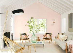
“First Light 2102-70 reflects a new definition of the home—a shift in mindset from the material to satisfying the core needs in life: community, comfort, security, self-expression, authenticity and ultimately, optimism.”http://www.benjaminmoore.com
Sherwin Williams
2020 Color of the Year, Naval SW 6244, is a rich navy that creates a calm and quiet confident surrounding.
“Navy is coming out of its comfort zone. 2020 is an empowering year of change that focuses on bringing your best self into the new decade. The next 10 years pave the way for wellness of the mind, body and soul – a clean palette for self-nurturance.
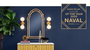
Giving a nod to Art Deco influences, Naval fuses the striking and bold opulence of Art Deco with the awe‑inspiring power of nature – from the infinite night sky to the mysterious depths of the sea – bringing navy out of its comfort zone to usher in an empowering New Year and fresh decade of change. This deep shade evokes a prominent sense of confidence that fuses timeless color with a fresh mix of natural materials and textures. “ www.sherwin-williams.ca
PPG
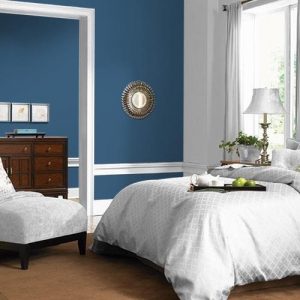
Chinese Porcelain—a rich and traditional blend of cobalt and inky blue—its 2020 Color of the Year. This color embarks calmness and a spirit of hopefulness, both always being seked out in this world.
“The need for simplicity and escapism from technology is, in part, the reason that consumers are craving blues like Chinese Porcelain that bring us closer to natural elements such as the sea and sky—creating serenity in any space,” said Dee Schlotter, PPG’s senior color manager.” http://www.ppg.com
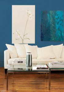
Find peace in a restless world.
“In a world where sleep is viewed as a luxury and the anxiety of a fast-paced world is all too real, it’s only fitting that the color trends for this upcoming year offer escapism in today’s technologically-driven society. Hand-selected by PPG’s global color experts, the PPG paint brand’s 2020 Color of the Year, Chinese Porcelain (PPG1160-6) is a blend of cobalt and moody, ink blue that imparts calmness and restful sleep while also offering the spirit of hopefulness – a rare commodity in a restless world.” http://www.ppg.com
Happy color! What’s on your design mind?

