Serac Eye Care and Eye Lid Center

Services Used:
-
Interior Design & Planning
-
Project Administration
-
Interior Furniture & Furnishings
-
Branding
Challenge:
With a wide customer base; including individuals with disabilities and the elderly, the layout design needed to be efficient and user friendly. The current wait time for clients was three hours, so the need to effectively manage the high volume of patients on a daily basis was a top priority. This included an easy transition as clients moved from diagnostics to the examination stage. It was necessary for a busy clinic to offer a private room and washroom for doctors to take a break during their limited down time. A separate rear entrance was needed for the doctors to come and go as needed.
The Solution:
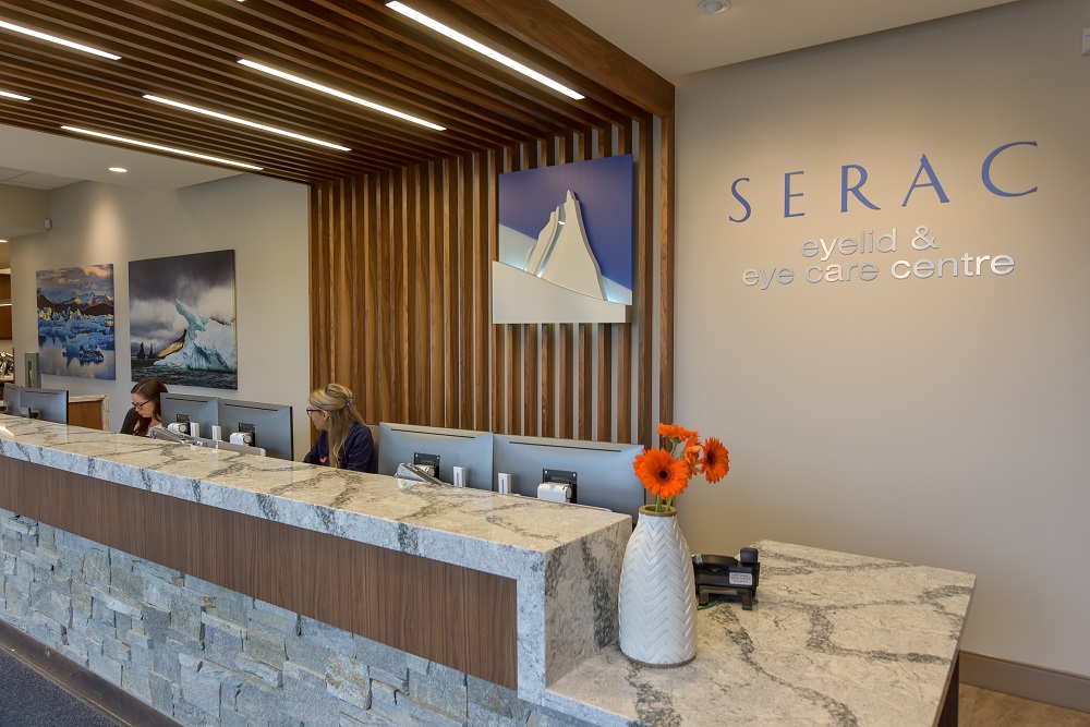
Serac means a pinnacle of ice and the doctor’s love for hiking transformed the clinics brand concept to be represented by these ice mountains. This is the perfect design idea to provide clients and staff with a calming, outdoor feel. Artwork, furniture and inviting touches; such as wood and quartz were selected to aid in creating a soothing, mountainous feel when visiting the eye center. From start to finish, the conception of this space took two years with the oversight of many moving parts.
Most important was the layout organization. Optimizing the flow-through of patients helped to decrease wait times and assist the staff in easier management of the high volume of clients.
As patients entered the reception area, an optional digital check-in is available to expedite the process. A central waiting area is used to process paperwork and organize the influx of patients. Diagnostics offers a separate wait room with color coded chairs to direct clients and provide staff with the convenience of locating the next patient in line. A staffroom at the rear of the clinic was designed for meetings and regular training. This area also offers a back, private entrance for employees.
As patients move through the eye care process, the flow of the space is a circular design, so clients can easily rebook before concluding their visit. The efficiency of the space enhances guest experience and affords the staff a new, organized and manageable space that is conducive to their office systems.
RODI Results:
At Decca Design Inc., we tackled the challenge of redesigning a healthcare clinic to cater to a diverse clientele, including individuals with disabilities and the elderly. Recognizing the critical need to reduce patient wait times and streamline the transition from diagnostics to examination, we embarked on a two-year journey to transform the clinic into a serene, mountain-inspired haven. By reorganizing the layout for optimal patient flow, introducing a calming design aesthetic with ice mountain motifs, and implementing digital check-in options, we significantly decreased wait times and improved the overall patient experience. The addition of a private staff area with a separate entrance ensured a better work environment for the doctors. This project by Decca Design Inc. exemplifies how a thoughtfully designed space can enhance operational efficiency, reduce stress for both clients and staff, and ultimately provide a superior healthcare service.

