Trinity Eye Care

Services Used:
-
Interior Design & Planning
-
Interior Furniture and Furnishings
-
Project Management
Challenge:
A new west side development has been years in the making, containing a variety of residential units such as single family, condos and apartment mixed use buildings. Anchor tenants include Save on Foods, Sleep country and Dollarama. The leasable space on the main floor of the multi usage building is the perfect location for an optometry clinic. Other professional services are also occupy these bays. The size of the space fluctuated three times before settling on 1645 square feet with a long list of requirements to accommodate within.
The Solution:
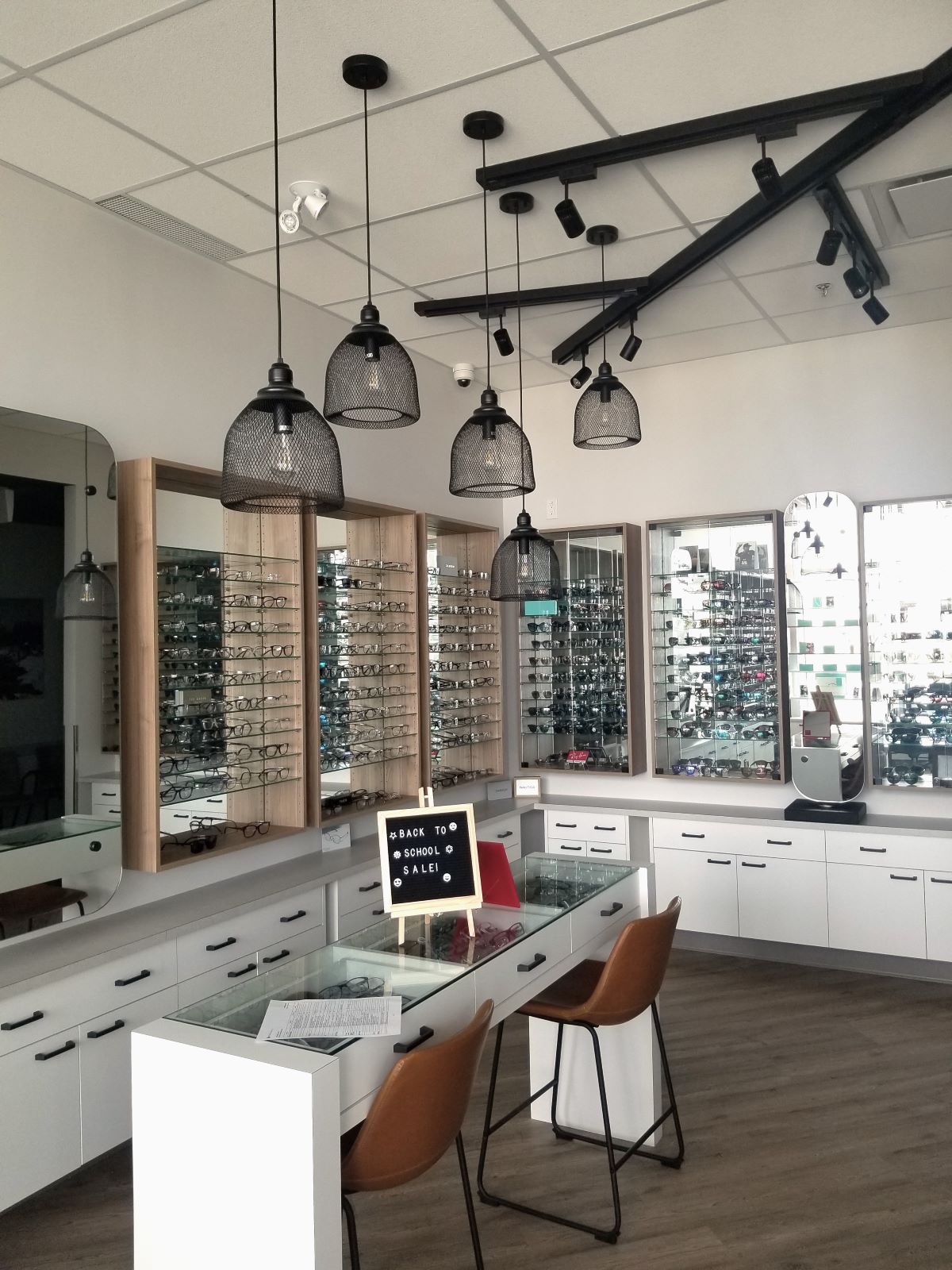
A smaller space presents an opportunity to design efficiencies to accommodate the many tasks required. Only upon deep analysis can you determine the needs and requirements and how they will work together. The showcase area displays eleven hundred frames, a fitting area and pick up counter for quick retrieval of your new glasses or contact lenses. Behind this area is the dispensing and lab area. The use of light colors, white and light wood tones in the millwork and mirrored backs on all shelving units makes a spacious first impression. A condensed linear waiting room area services many functions with a deep teal drywall ceiling and feature wall. From this space you can access the consult area, pretest area designed with both current and future equipment needs, lens training counter, three exam lanes, washroom and staff room. The artwork is original photographic prints from one of the doctor’s blown up to a larger scale and finished in a black floating frame. An owl theme is found throughout the clinic including the washroom and a woodland path image conceals a full storage wall. Can you spot the owl?
RODI Results:
The development of this optometry clinic by Decca Design is a notable example of RODI achieved through a space-conscious floor plan. Despite the challenges posed by fluctuating space availability and a final footprint of 1645 square feet, the design successfully accommodates an array of essential functions. The clinic features an inviting showcase area for frames, a versatile waiting area, and a variety of operational spaces including exam lanes, a dispensing area, and staff amenities. The use of light colors, mirrored shelving, and strategic artwork, including an owl theme, enhances the perception of space and creates a welcoming atmosphere. The effective utilization of a compact area to house all necessary components of the optometry office demonstrates Decca Design’s ability to balance practical needs with creative design solutions, making the clinic both functional and visually appealing.

